Friday, 26 October 2012

Tutorial: A Simple Pumpkin Vector Graphic


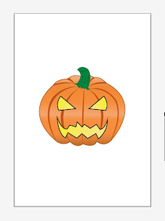
Here is what your pumpkin vector will look like when it is finished.

First of all open Adobe Illustrator and click new to open a new document. Then make sure you fill colour is blank but the stroke colour is filled and click on your pen tool. Start to draw the outline of the main shape of your pumpkin like below.


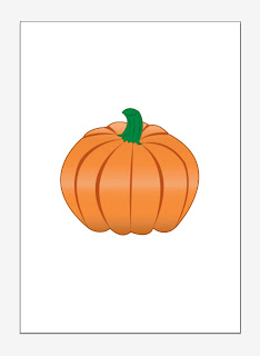
Once you have drawn this out you want to fill it. I choose to fill it with a gradient to give a bit of volume to the shape. Go to windows drop down menu, click swatch libraries, then gradient then fruit and vegetables, then choose the carrot gradient. If you hover over the gradient swatch you will see the name of it.

Click on your gradient tool to make it vertical by dragging it up or downwards and it should look like the image below.


I filled my stroke colour with a dark orange C 0 M 75 Y 100 K 25.

Now you need to give you pumpkin detail to make it look realistic. Click new layer (name your layers as you go along) and choose your pen tool again then start drawing skinny crescent moon shapes and fill then them with the same colour as your stroke on the pumpkin shape. You can see the desired effect in the image below.


Now your pumpkin is starting to take shape (excuse the pun). Now we will add a green stubb on the top of the pumpkin. Make a new layer for this. Get your pen tool and start to draw a stubb and fill with green C 100 M 0 Y 100 K 25 and fill the stroke with a darker green C 100 M 0 Y 100 K 50. Add some detail into your stubb using the pen tool again if you wish. I added some shadow lines in same green as the stroke of the stubb as you can see below.


When you have this done add a new layer and we will start the eyes and the mouth of the pumpkin. Again select your pen tool and start draw the eye like a triangle turned sideways. I curved the side of the eye for a better shape. When you draw one, select it, hold Ctrl and Alt and drag your mouse away from the eye to make a copy of the eye then with the copied eye selected go to windows and transform and click the down arrow at the top left to see the drop down menu. From that click horizontal to change the angle of the eye. Fill the eye with a yellow gradient, I thought it best to make a gradient with light and dark yellow. Do the same for the mouth draw it to your desired shape and fill it with a gradient to match the eyes. You do not need to copy the mouth or change the transformation. It should look something like the image below.


The last thing you need to do is fill the strokes with black on the shapes and now you have a very simple but detailed pumpkin vector. I hope you enjoyed this tutorial.


Wednesday, 17 October 2012

Tutorial: How to make a Disco Ball in Photoshop

In this tutorial I would like to show how to make a nice bright, fun and shiny disco ball. Here is what the final result with be.


The effect on the disco ball was created by http://photoshoptutorials.ws/photoshop-tutorials/photo-effects/digital-star-effect and this is an amazing tutorial on how to get the effect of a Digital Star Effect. I will do this effect and show you how to use it in a shape and change the tones to get your desired effect. 

This could also be used for concert lights or a nightclub poster, serious props to http://photoshoptutorials.ws/ for coming up with this effect.

Lets get started...

Step one: 
Choose an image, any picture that has a bit of detail and a few colours in it will work. * I an using an image of me and friend on halloween because I like it *


Step two: 
Open this image in Photoshop, duplicate the layer and make guidelines like the image below for disco ball shape.


Step three: 
Select the path tool and start to draw your circle as accurate as you can get it.


Step four: 
Press control on your path and copy, then add a new layer and paste it into the new layer. Deselect the image layers.


Now it should look like the image above.

Step five: 
Now you need to add the effect I mentioned above. Click this link and follow the instructions http://photoshoptutorials.ws/photoshop-tutorials/photo-effects/digital-star-effect . When you have done this it should look like the image below. I have adjusted the brightness and contrast here to add effect.


Step six: 
Make a new layer and draw a circle that covers your existing disco ball fill it and add a black stroke at your desired width.


Apologies for the random line across it that is not supposed to be there but I think my pc is acting up. So ignore that but now you can see an outline and glow from the disco ball.

Step seven: 
Go to layer adjustments to change around brightness and contrast and hue and saturation until it looks good to you.

Step eight: 
Now go to your brushes and select assorted brushes and click on the star brush number 50 like below.


Step nine: 
Select the white fill colour and dot your stars on where you think needs a bit of sparkle. Add new layer and fill colour it with black so the disco ball pops out and your stars can be seen.


Here is the final design


I hope this tutorial was helpful to you.


Monday, 20 August 2012

Tutorial: How to draw 3D Chess Pieces In Illustrator

This tutorial will show you how to draw a 3D Chess Piece in Adobe Illustrator CS5 that you can apply to other chess pieces. Here is the finished images.

1. Open Adobe Illustrator click File and New to open a new page. Select your Pen Tool.


2. With your pen tool selected start to draw the path shape below. The shape is half the chess piece. Do not close the path off press your black selection tool to select it. The image below shows the path drawn out for the Queen Chess piece.


3. Now deselect your fill colour swatch to none and pick a colour for the stroke. See the image but I chose a light grey colour: C=0 M=0 Y=0 K=10


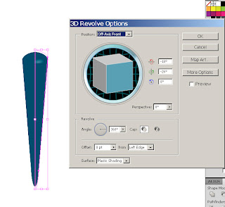
4. With your path selected go to Effects - 3D and click Revolve to bring up your 3D options.

5. Now set your options the same as the image below. It might be defaulted this way but do check so it is correct.


6. Press the preview button to check that your 3D path looks the same as the image below.


Your 3D chess piece should start to take shape.

Now it is time to add a drop shadow effect.

7. Go to Effects - Stylize - Drop Shadow.


Use the same optoins as the image below.

 8. Select ok and you will have your finished product. 


Now you have made a simple 3D Chess Piece! I hope you found this tutorial useful. You can repeat these steps with all other chess pieces other than the Rook as it does not work with this. When I will figure out how to do a nice 3D Rook chess piece I will add it to the blog to complete the chess set.


Friday, 17 August 2012

Tutorial: How to do a 3D Table Lamp in Illustrator

This tutorial will show you how to draw a 3D Table Lamp in Adobe Illustrator CS5. Here is the finished image.

1. Open Adobe Illustrator click File and New to open a new page. Select your Pen Tool.

2. With you pen tool selected start to draw the path shape below. The shape is like half a batten. Do not close the path off press you black selection tool to select it.


 3. Now deselect your fill colour swatch to none and pick a colour for the stroke. We are going to do the lamp shade part first. I chose a navy colour.


4. With your path selected go to Effects - 3D and click Revolve to bring up your 3D options.


5. Now set your options the same as the image below. It might be defaulted this way but do check so it is correct.


6. Press the preview button to check that your 3D path looks the same as the image below.


Now your shape will look similar to a batten.

7. Now hover your cursor around the top right corner of your path to transform the shape. I am going to turn to the left to get the desired effect.


When you let go you will start to see a lamp shade shape occuring. Keep transforming the shape until you are happy with the shape. Here are a couple of examples:


8. Once you have done this, press new layer and start drawing the path for the pole/base of the lamp. Do not close the path off. Like this image below.


9. We are going to do the exact same steps we used to make the lamp shade above. Once again deselect the fill colour and select a stroke colour as you can see above the part highlighted with a yellow circle. I chose a gold colour.

10. Apply the exact same Effects as the lamp shade Effects - 3D and click Revolve.


Your result should look like this image below.


Apologies for the shadow on my image, I do not know why that keeps happening!

11. Now move the Lamp layer above the pole layer so that the pole is not above the lamp.

Your finished result should look like this.


Now you have made a simple 3D Table Lamp! You can now add some detail if you like to the shade or a background. I hope you found this tutorial useful.


Friday, 3 August 2012

Tutorial: Scribble Text Effect Illustrator

Today I will show you how to do a scribble effect on text in Illustrator that would also be useful for a sketch effect or a black marker effect. So here is what the finished product will look like:


I used the Britannic Bold font, you do not have to use this but I would suggest picking a chunky font for the best effect.

1. Firstly, open Adobe Illustrator, go to "file", "new" and select your page size.


2. Then select the "Type tool" (T), choose your font and start typing your desired text.


3. Select all text and deselect the "fill colour" and "stroke" so that there is no colour on any on the text.


4. Open the appearance window on your page and with "type" selected on the Appearance panel click the top right button and select "Add New Fill". Make sure the default colour is set at black.


5. Select "Fill" in the Appearance window, click Effect - Stylize - Scribble. Edit the "Scribble Options", change the "Angle"to 45, the "Path Overlap" to 0 pt, "Path Overlap Variation" to 2 pt, "Stroke Width" to 1 px, "Curviness" to 0%, "Curviness Variation" to 50%, the Spacing to 2 pt and Spacing Variation to 1.5 pt.


Result from Scribble Options

6. Now to add a stroke to define the edges. Add a stroke of 1pt for black pen effect, 2pt for a nice solid edge or 3pt for the black marker edge effect. I am going to use a stroke of 2pt.


Now you have a nice Scribble effect on text that has a lot of uses.

I chose the "Back to School" wording as it reminds me of posters I used to see when school books where on sale and it was that time of year again!!! Thankfully, I do not have to worry about that anymore :) but if you ever need to do up a poster for this type of thing you have one element to start with. I hope your enjoyed my Tutorial.